
Brand Strategy | New Brand Launch
SUN Behavioral Health | Brand World
A new joint venture needed a unified identity that could bridge two healthcare brands, reflect both existing systems, and clearly express the partnership.
Context
Two healthcare brands needed one unified identity.
SUN Behavioral Health and St. Elizabeth Healthcare formed a joint venture to build a new 197-bed psychiatric hospital in Erlanger, Kentucky. The 149,000-square-foot, $40 million facility was created to expand access to inpatient behavioral health care and relieve pressure on St. Elizabeth’s emergency departments, where behavioral health patients were increasingly contributing to high volumes and extended wait times. Partnering with SUN, a behavioral-health-focused organization, allowed St. Elizabeth to transition 197 beds into a dedicated facility while retaining 25% ownership in the joint venture. The project required a complete co-branded identity system that could unify two organizations, support stakeholder alignment, and carry through architectural, construction, and launch phases.
Action
A sunrise-over-hills concept, built to bridge both brands.
A full co-branded visual identity system was developed to support the joint-venture facility from concept through construction and opening.
Logo Strategy
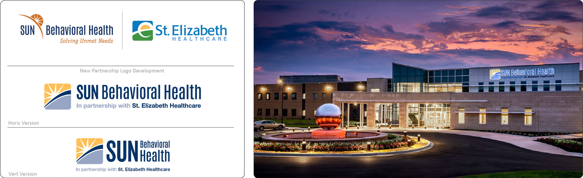
The identity needed to bridge two organizations and reflect the joint-venture structure. Both brands shared a natural visual connection: St. Elizabeth’s mark is bright, bold, and approachable, representing a new day rising over the bluegrass hills of Northern Kentucky, built from green for the KY hills, yellow for the sun, and blue for the sky. SUN Behavioral’s own mark centers on that same sunrise theme. The final lockup combined these shared elements into a unified sunrise-over-hills concept. Earlier directions using full logos and partnership taglines were too text-heavy and failed at small sizes, so a compact integrated mark was created. The design echoed St. Elizabeth’s visual language to reinforce credibility, while remaining weighted toward SUN to reflect its majority ownership.
Brand System Development
- New partnership logo developed
- Complete collateral system, including letterhead, envelopes, business cards, news release templates, general cards, and a brand presentation deck
- Architectural and construction visual support, including 3D axonometric posters
- Marketing and communications plans from groundbreaking to ribbon-cutting opening
Result
A partnership identity that's still visible today.
The co-branded identity unified two major healthcare organizations and supported a multi-year facility launch from early concept through opening. The brand system strengthened community awareness, aligned stakeholders, and provided consistent visual standards across architectural presentations, construction signage, and launch materials. The final identity remains visible on the facility today, reinforcing the partnership and supporting long-term brand recognition.