Brand Strategy | Identity
St. Elizabeth | Brand World
Building one coherent visual identity across a six-hospital system.

Context
A Growing System Needed a Unified Identity
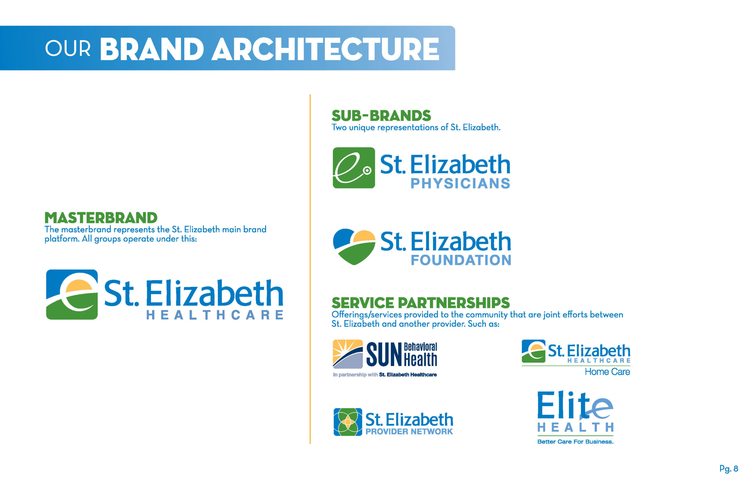
As St. Elizabeth expanded its services, merged with St. Luke, and grew into a regional health system, its brand expanded in every direction. New entities like St. Elizabeth Physicians and the St. Elizabeth Foundation emerged, each requiring its own identity. Over time, independent decisions created a fragmented brand across hospitals, physician practices, and philanthropy. The organization needed one unified visual identity that could scale with its growth and support its evolution from a community hospital into a regional destination for excellence.
Action
Creating A Scalable System for Every Touchpoint
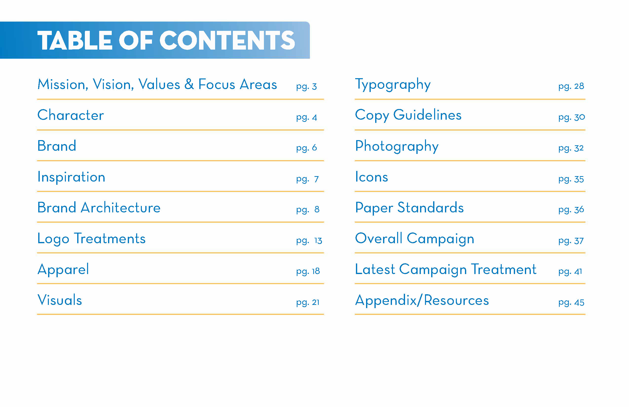
I built the full Brand World from the ground up, creating a single, coherent identity system for St. Elizabeth Healthcare, St. Elizabeth Physicians, and the Foundation. The system established clear standards for logo architecture, color, typography, photography, tone of voice, apparel, and campaign execution. It aligned every touchpoint, from signage to marketing, under one unified platform that reflected the organization’s expanded services and long‑term vision.
Result
One Cohesive Identity Across Hospitals, Physicians, and Community
The Brand World delivered a unified, scalable foundation adopted across the entire system. Every team gained one source of truth for how the brand appears across facilities, physician practices, campaigns, and community initiatives. The identity strengthened consistency, supported St. Elizabeth’s growth, and created a cohesive brand expression as the organization advanced from a community hospital into a regional leader and destination of choice.